Visualize waiting times reveals that most work time is spent waiting rather than actively working.
Everyone is busy. Nothing is getting done. Here's why.
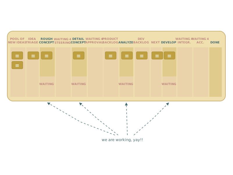
Also known as the "We are so f*ing agile" pattern — this makes all waiting times in the system visible, revealing that most work time is spent waiting, not being actively worked on.
The Problem
The team is working hard. Utilization is at 100%. And yet — things take forever. Because "working hard" and "work flowing" are two completely different things. Most of the time, work isn't being worked on. It's waiting.
How It Works
The entire value stream is mapped on the board — including every waiting phase, not just the active work steps. Columns where work primarily waits are highlighted in color (typically red or orange). The result is uncomfortable: rows of waiting columns with only one or two active work columns. The ratio is painful to look at — which is exactly the point. Speeding up the workers doesn't help; it just moves work to the next waiting state faster.
When to Use It
- Lots of work is started; little is finished
- There is pressure to "work faster" — even though that's not the bottleneck
- Work doesn't flow seamlessly: approvals, decisions, appointments create invisible queues
- The organization has significant overhead built up over years
Related Patterns
- Doing vs. Waiting — drills deeper into individual columns to uncover hidden waiting within them
Your play!
Get the cards and maps — all 18 FL2 Flow Patterns plus the new "Identify your Flow" companion map (A3 + A2 in EN, A3 in DE), ready to use in your next FL2 workshop or board design session.